
Why The Change?
When I started Neon, my goal was to be a marketplace for independent roasters all around the world to be showcased. Being a touring musician for most of my life, I’ve met some of my now closest friends in countless incredible shops around the world. It was that sense of community that drove me to open Neon.
Since we opened last year we received a cease and desist by a company called Dogwood Coffee from Minneapolis. Their claim of infringement was based on their US trademark for one of their blends “neon espresso”
We felt strongly that we were not infringing for several reasons, particularly since we are a different class of trademark. We fought to coexist with their product. Ultimately, we were forced to change our name.
We debated just simply changing our name and keeping our logo but through the process we discovered our core values and what Neon as a brand meant to us. We saw it as an opportunity to create a new identity.
Which brings us to our new name, Dayglow.
Why Dayglow?
We chose the name as a reference to what Neon means to us literally and figuratively. We feel the name Dayglow truly embodies how we feel when it comes to highlighting vibrancy and refined roasting. We like to support small independent roasters doing exciting things and build awareness for their brand. Our focus is to showcase bright and sweet coffees and with Dayglow, our coffee program will be even more selective.
What’s truly exciting about Dayglow as a brand, is that it’s more than just coffee. It’s about community with those around you. It’s the friendships that are made when you least expect it. Most importantly, it’s about the many small things, wether It be a great cup of coffee, the joy of riding a bike or playing an instrument you love.
It’s what makes your Dayglow.
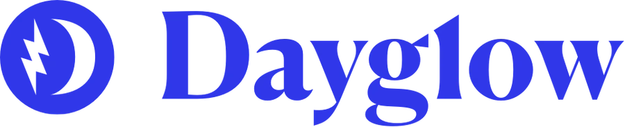
Our Logo
Compared to Neon, Dayglow as a word mark is less stylized and much cleaner. We diverted to a blue primary for its tranquility, loyalty and confidence. We feel like those are characteristics that represent us and how we want our customers to feel. We want to maintain the playfulness of Neon but a more modern and refined approach.
The logo and icons represent our identity.
-The 6 sided star is a nod to my past (Chicago)
-The lighting bolt is a symbol of our present. (Neon)
-The crescent moon ‘D’ is our future (Dayglow)
Together they create a vision of joy and excitement.
What’s next?
In the next few months we’ll be announcing new locations (LA + Chicago) along with an expanded online service. We also have some very exciting collaborations with our favorite roasters that we look forward to sharing. We adapt and we move forward and we can’t thank you enough for joining us along the way.
-Tohm Ifergan